Monday.com review: Top takeaways
What’s awesome
Ah, project management…#thestruggleisreal. I have tried many different project management software solutions over the years in an attempt to find the one that actually makes it easier to manage lots of people, projects and chaos. I’ve mostly found more frustration.
But honestly, when I first got this tool, I ran around telling everyone that my life had changed. Suddenly, I had a place to organize everything and a way to easily view it (hello, Gantt charts!) so I could actually forecast and plan ahead. I’m writing this Monday.com review in the hopes that you can have this moment, too.
And as a long-time Basecamp user, all I can say is, there’s really no comparison (but I will make some here anyway).
There’s so much that’s awesome about Monday.com, but first, a caveat. As with any technology, the tech is only as good as the process you put behind it. Monday.com is no different. You’re going to need to get your process in order first to get the most value.
What kind of sucks
Their pricing model. More on this later, but honestly, it feels like you need to earn a degree in their pricing structure before you’re able to choose the right tier. Just saying, it shouldn’t be this hard.
On the plus side, they do offer a “forever free” tier, which seems to be a recent-ish addition in response to user feedback.
What’s missing
Really, not much. Somewhat unlike Basecamp which has a file manager feature, you’ll want to keep documents stored elsewhere. Technically you can upload documents directly from your computer, but there’s no easy way to navigate your files later. There are asset storage workarounds you can find using Boards (a Board is essentially a task list or plan view), but it’s a little clunky.
But good news, they integrate with tons of storage apps (Google Drive, Box, DropBox to name a few), so my suggestion is to store your docs elsewhere and then just link to them from your Monday.com items for easy reference. They also integrate with lots of other solutions that marketers use, including HubSpot CRM, MailChimp, Jotform, Hootsuite and more.
There’s one other thing missing that I find to be a benefit. There’s no group “conversation” area (think: message boards or campfires in Basecamp), which I find helps keep comments specific to the item referenced. There’s a tendency in Basecamp for all conversations to end up in one dumping ground, making it very hard to untangle the thread later.
My two cents
Monday.com is great and I highly recommend it. It does require some planning around how you want to organize things, but it’s very flexible once you have that nailed down.
Easy like Sunday morning? Monday.com interface
The good: It’s basically a spreadsheet on ‘roids
So, not everyone is going to like this as much as I do. But I’m someone who has traditionally managed things out of spreadsheets, so the approach that Monday.com uses is a great fit for me. You add items (rows) for each task or project, and then add columns to hold detail.

Screenshot taken by author
The good: Some cool columns
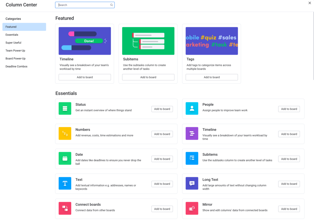
And speaking of columns, they are very flexible and powerful. You can track the tasks’ owner, status (with optional progress bars) and due date or timeline. An item can have subitems (think: a parent task and its related steps). But you can also add a column to attach files, or add a column to connect an item to another row on another Board.
You can add boards of dropdown items to categorize things. On certain tiers, you can add time tracking. You can add columns to capture links or text comments or almost anything you can think of, from voting to ranking to formulas.

Screenshot taken by author
The good: Tons of views
My biggest gripe with Basecamp was that there was no way to plan ahead. You could create a bunch of tickets and they sort-of aligned themselves to a timeline, but the view was not great. I tried so many Gantt chart plugins to try to visualize the Basecamp to-do’s in a more useful way, but none worked well.
Eventually, the random list of tickets would become a cesspool of out-of-date info. Managing Basecamp became a whole separate project on my to-do list. Those days are gone!
Monday.com comes with a bunch of views that automatically populate, from Gantt to Kanban to Form to Calendar to even Word Cloud. Suddenly, I could actually look ahead on my project plans and see what was coming. Hear the angels sing!!

Screenshot taken by author
The good: Automations
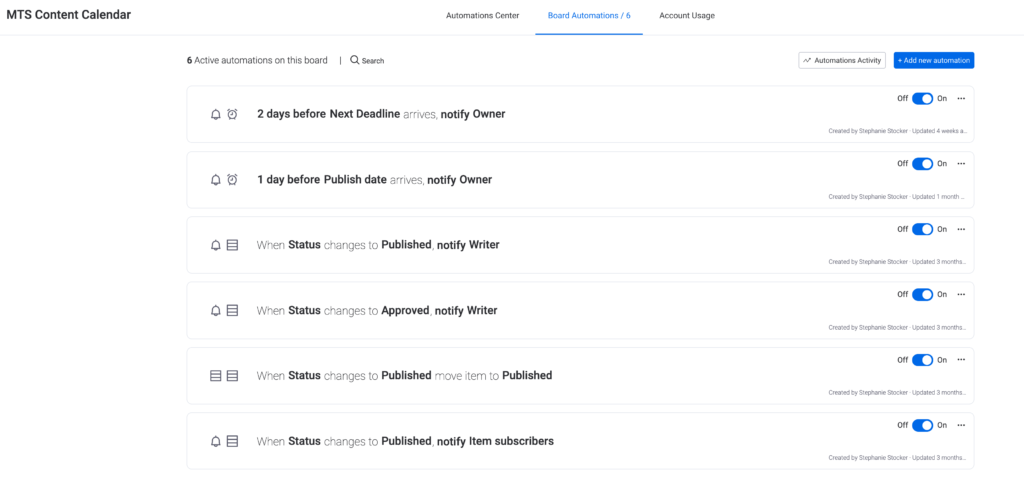
With Monday.com, you can set up and customize all types of automations to do pretty much whatever you want. Want to send a notification automatically based on a status change on an item? Looking to move items from one group to another once complete? Want to send reminders to the task owners two days before a deadline arrives? Presto!ffintek
With automations, you can do all this plus a whole lot more. And the automation builder view is really user-friendly.

Screenshot taken by author
The good: The marketplace
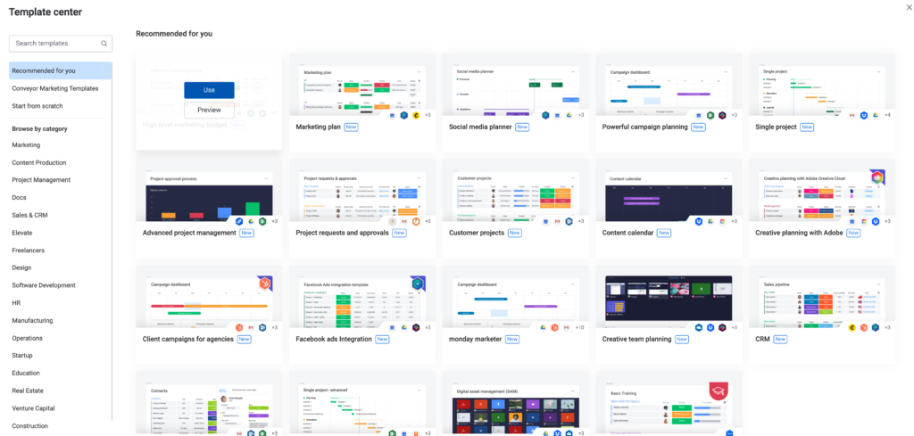
While you certainly can build a Board from scratch, you don’t have to. You can browse a marketplace full of free templates for Boards for all different purposes, from marketing plans to software builds to content calendars. You can also build and save your own templates.

Screenshot taken by author
The not-so-good: Monday Docs
To be fair, this feature is still in beta. It’s basically Monday.com’s answer to a Google Sheet (DropBox has Paper, Box has Note). I’ve found it to be a little glitchy and not that exciting. It might be better in the near future; for now, I’m sticking with Google Docs.
The neutral: It can be a lot
As you can tell, I’m a big fan. But I’ve also been called a project management nerd (hurtful!). And I’ve definitely met people (self-described “not process people”) who absolutely hate the structure and detail of this tool. To be fair, they would probably hate any comparative solution as well.
It all comes down to who uses it and how they use it. It can be as detailed and prescriptive or as loose and flexible as you want.
Start me up: Getting Monday.com
I found it pretty easy to get started. I didn’t need any training or classes, although it did take me a few days of poking around to figure out the best ways to use things. If you like to learn that way, this should be a pretty natural fit.
The good: Import data
Already using a spreadsheet to manage your work? Well, good news – you can automatically upload it to Monday.com. Be forewarned that it will probably require a little clean up once imported, but it will save you a ton of copy/paste initially.
A little help from my friends: Monday.com support
As I was writing this handy-dandy Monday.com review, I realized that I have not once had to contact their support for help with anything (I’ve been using it pretty heavily for about four months), so I can’t really rate this except to say that it’s the only project management tool I’ve used yet that hasn’t had glitchy bug issues.
So…take that for what it’s worth.
What’s it gonna run me? Monday.com pricing
As I mentioned, this is my biggest complaint with Monday.com. The pricing tiers are complicated, and to make it even worse, they offer different kinds of account: member accounts for in-house and guest accounts for freelancers, clients or partners. Different numbers of each type are allowed on each tier, with different prices for additional (and a certain number of guests counts as one member…).
It can get really confusing and a little overwhelming to figure out the right tier for you. The good news is the pricing is reasonable, and the setup once you’ve purchased is easy.
I’d recommend that you start with the free version and just start playing around with it. Add more functionality or additional seats as you need them.


